In the past, a responsive email design was considered to be a luxury. But today, it has become a necessity. HTML email developers need to optimize emails for various devices apart from mobile phones and desktops because people also use their tablets, folding phones, and other mobile devices to check their emails. All these minor changes in the dimension of the device significantly affect the way your target audience sees your emails.
Table of Contents
What is a responsive email?
An email template that renders correctly irrespective of the device in which it is viewed is a responsive HTML email template. The design of the responsive email will change according to the size of the screen of the target audience.
Which is the preferred medium for reading emails?
Mobile phones have become the preferred medium of reading emails. And you have to adapt accordingly. A study by litmus suggests that 42% of all emails are read on mobile devices. Out of these, 28% are read on iPhones, 9% on iPads, and 65% on other mobile devices. Webmail opens accounts for 40% of all the email opens, and the remaining 18% are opened on the desktop.
5 best practices to follow while designing an email template
1. Size it right
While designing an HTML email template, there are multiple elements where size is a crucial factor. You need to pay attention to the more minor details like character limitations and the size of the image that you are inserting in your emails. Character limitation suggests that your subject line and preheader should be within 65 characters to fit in all the devices and different platforms.
Additionally, the ideal width of an email is 600px. If you use this measurement, your email will render appropriately on all devices and browsers. The images should be of high quality and optimized to open at 72 dpi for faster load time.
2. Adopt the mobile-first approach
HTML email coders are now embracing the “mobile-first” design approach. This approach includes designing an email template primarily for mobile users. Following the completion of the design, the email marketer optimizes the design for desktops. The mobile-first approach increases the open rate of emails on mobile phones. Such designs are most suitable for simple transactional emails, account updates, and password reset notifications.
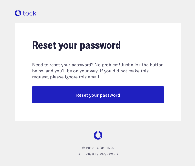
Tock follows a similar approach with their password reset emails. The heading font size is significantly larger than the rest of the body. The email width is also suitable for mobile devices and desktop view. The CTA button is well-placed. 
3. Make CTA buttons prominent
CTA buttons are essential to increase the interaction of your target audience with your emails. You can use a white border to make the button look more prominent in your emails. Contrasting colors can also be used to achieve a similar effect. The generic CTA statements are still effective, but you should try to be more creative and come up with phrases that suit the aesthetics of your brand image.
On a more technical note, you should make use of bulletproof CTA buttons. If the reader has disabled image download, your image CTA will not load on their device, and there will be no further interaction with your email. Hence, you should always use HTML embedded CTA buttons along with web-safe fonts. Ensure that when the email is being opened on the phone, the CTA button should shrink to fit the screen while still legible.
Uber places their CTA button right between their two paragraphs, so the customers don’t have to scroll to the bottom to interact with their email. Furthermore, you can notice that the email is well optimized and renders similarly on both desktop and mobile devices.

4. Stay safe with web-safe fonts
Using custom fonts to make your email stand out in your target audience’s inboxes is a great idea. However, if your email recipient does not have that font installed on their computer, the email will render with a monospace font. Your email’s aesthetics can be easily ruined if you do not use web-safe fonts as your fallback font.
Web-safe fonts are user-friendly fonts that are pre-installed in the majority of devices. The sans-serif and serif fonts families are web-safe fonts. Fallback fonts are the fonts that will render if the device lacks the original fonts. You can use multiple fallback fonts to protect the aesthetics of your emails.
5. Say no to image-only emails
You should never use an image-only template in your marketing campaign. Your message will be lost if you are using texts on the image. Therefore, you should always try to enter HTML text messages anywhere you can. Image-based emails also consume a lot of data and might take some time to load in the recipient’s inbox. If you are using images as background, try to keep it simple. Avoid adding important text over them, as it will not render in the email clients which keep default image download off.
Conclusion
Creating responsive HTML email templates might seem simple, but a lot of thought goes into designing a well-optimized email template. Even small changes can massively affect the user experience. Hence, take a breather and ensure that you follow the above practices while designing responsive emails for your marketing campaigns.
Author: Kevin George is the head of marketing at Email Uplers, that specializes in crafting Professional Email Templates, PSD to Email conversion, and Mailchimp Templates. Kevin loves gadgets, bikes & jazz, and he breathes email marketing. He enjoys sharing his insights and thoughts on email marketing best practices on email marketing blog.


